Restaurant Group
Just Eat Local
-
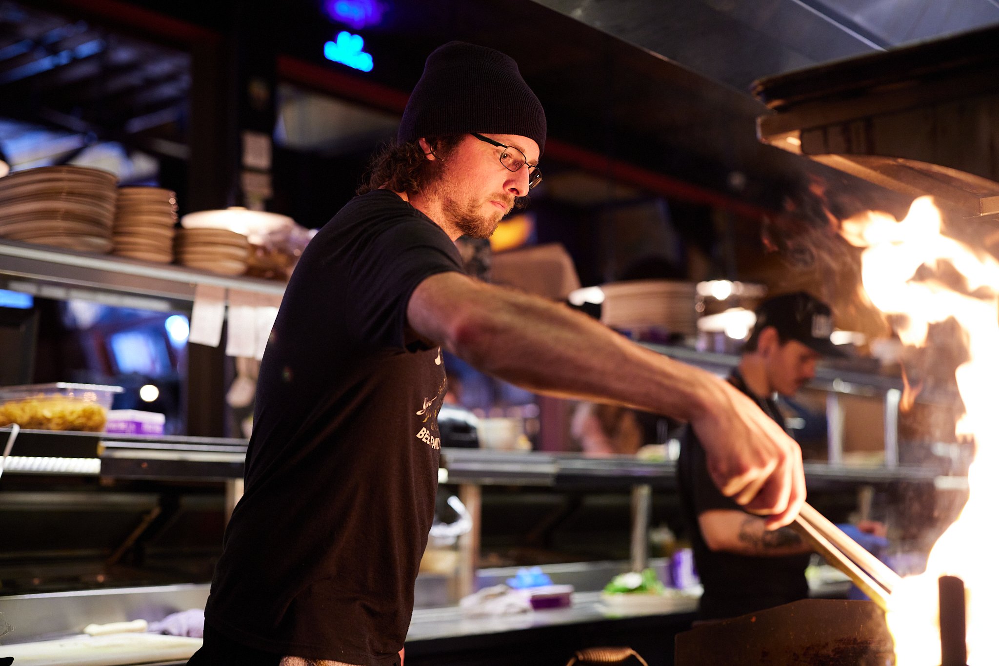
For twenty years the team behind Bittercreek Alehouse, Red Feather Lounge, and Diablo & Sons Saloon contributed to the story of Boise through thoughtful food, good beverage, and great people. Over time, they refined their approach by producing articles, videos, photos, and more; emphasizing locally-sourced food, craft drinks, the culture in the kitchen and on the farm, and everything in-between. Along the way, they continue to forge as many meaningful connections as possible to bring our patrons and readers closer to those who make the community and culture what it is.
Hired by Just Eat Local as the Creative Director, we aimed to bring this initiative to life by creating a team of employees and contractors to help build a visual identity, content, digital marketing, social media, and handle their public relations for all of their brands.
We asked owners, Jami Adams and David Krick, what the stories and concepts were behind each restaurant, to better understand what their intentions were with each business. When we had our stories straight, we looked at old designs, menus, books, and anything the internet had to offer to better understand how we could visually represent each brand.
Without totally overhauling the existing brands, we gave the existing marks a face lift to make them more flexible and responsive. Once we addressed the visual identities, we began to think about how all of these brands live under the parent brand Just Eat Local.
We felt the next best place to start was on the websites. Each site was scattered across different applications, programs, hosts, and a slew of other subscriptions that were costing the business an unnecessary amount of money. We brought Idaho websites in to simplify the situation by putting us on one hosting site, building in Google Analytics and finally building out our websites based on our identity systems and some creative direction to ensure things were on track.
To create more equity in Just Eat Local, we decided to turn the site into a media outlet focused on food, beverage, culture, and more associated with the food culture in the state of Idaho. The result is a wide range of articles and videos that are educational, serious, fun, and informative.
Finally, we brought on the e-comm shop to help better sell our apparel products, gift cards, and headwear to generate more passive income. 1 year since the launch and we have seen huge spikes in our engagement on each site. We even came out with a 4 episode video series called “Beer Time with Cody,” a satirical show about beer education.
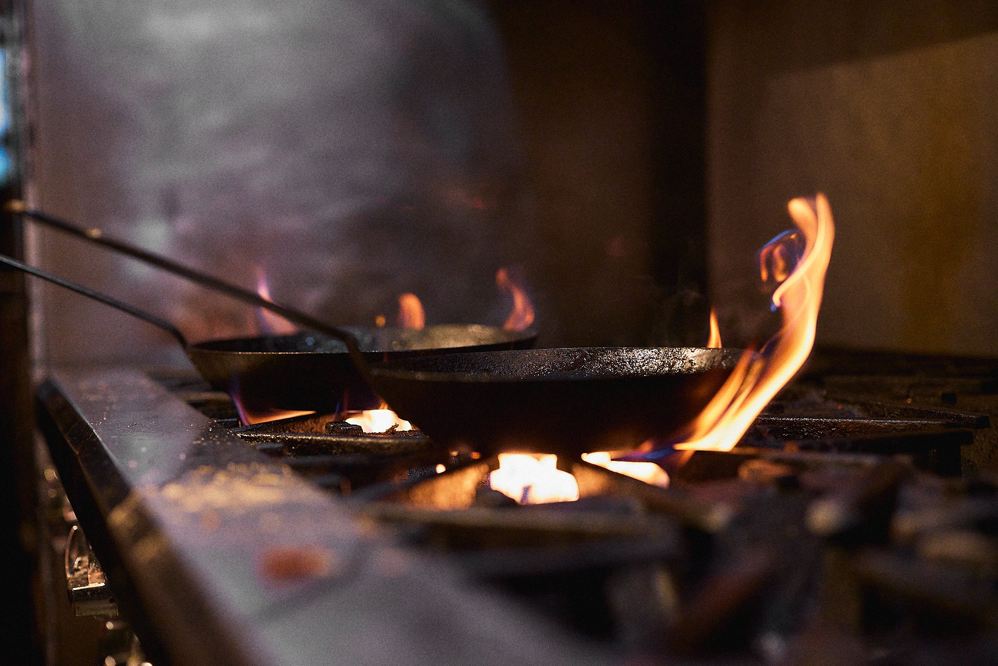
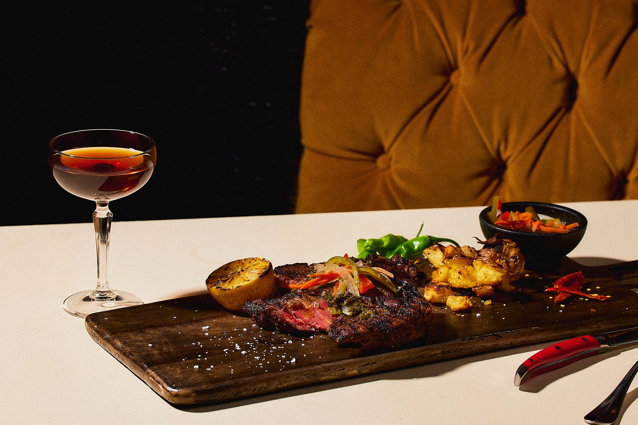
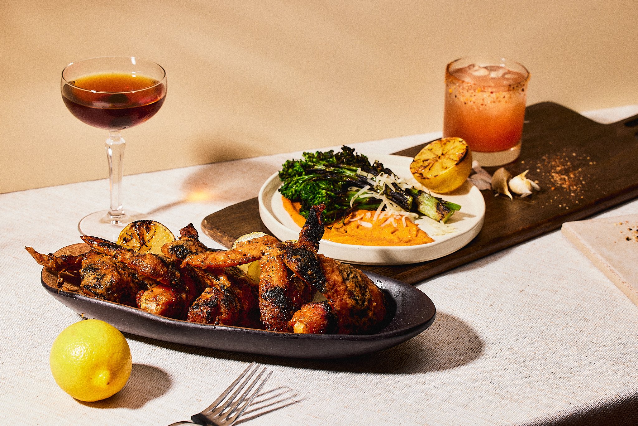
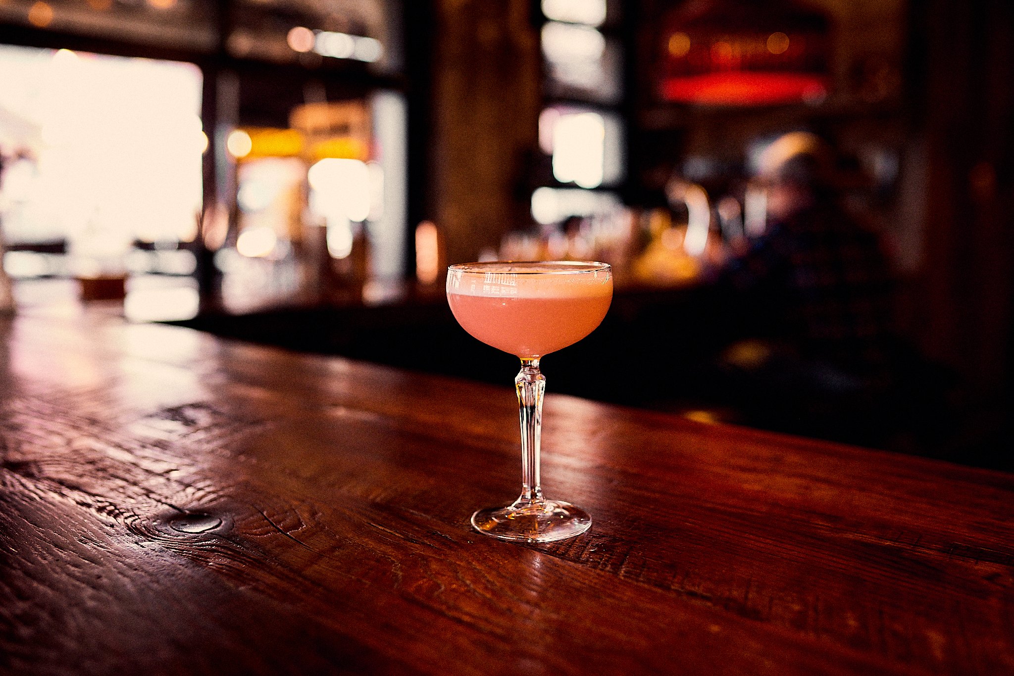
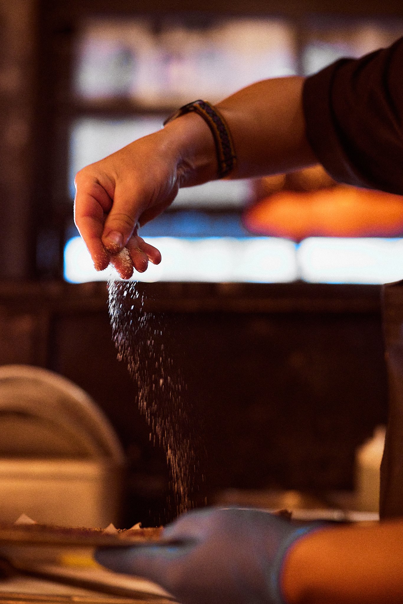
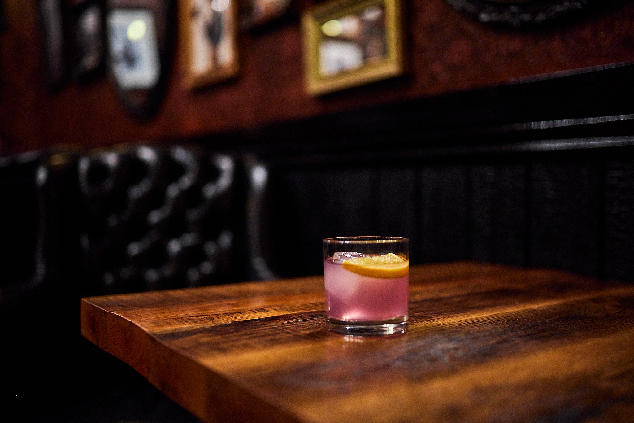
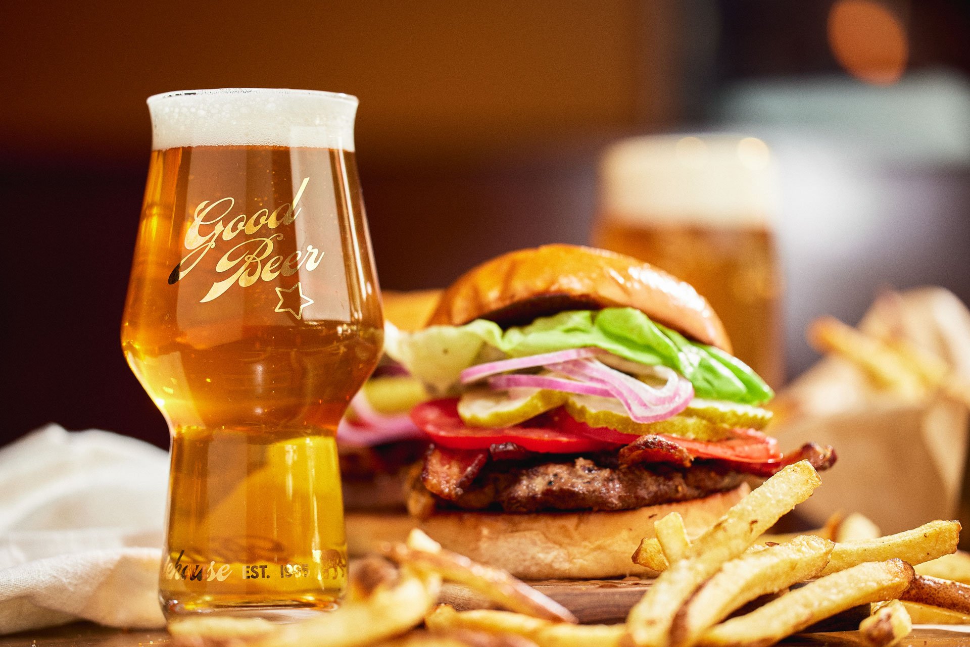
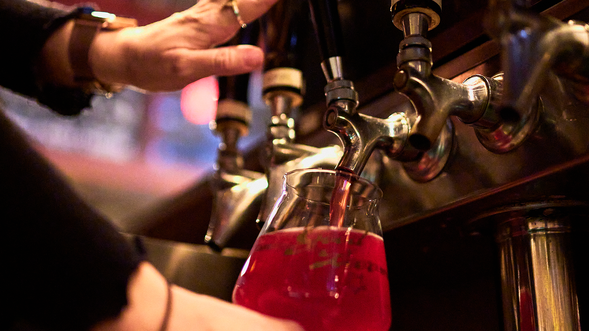
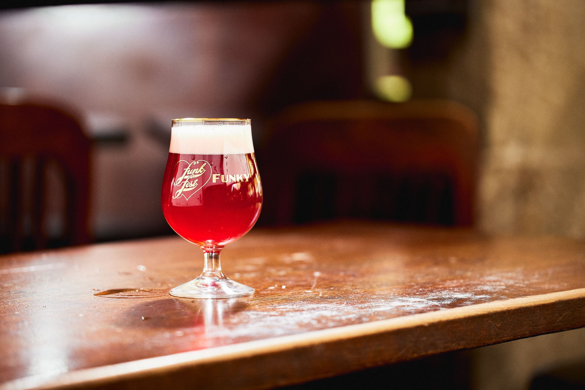
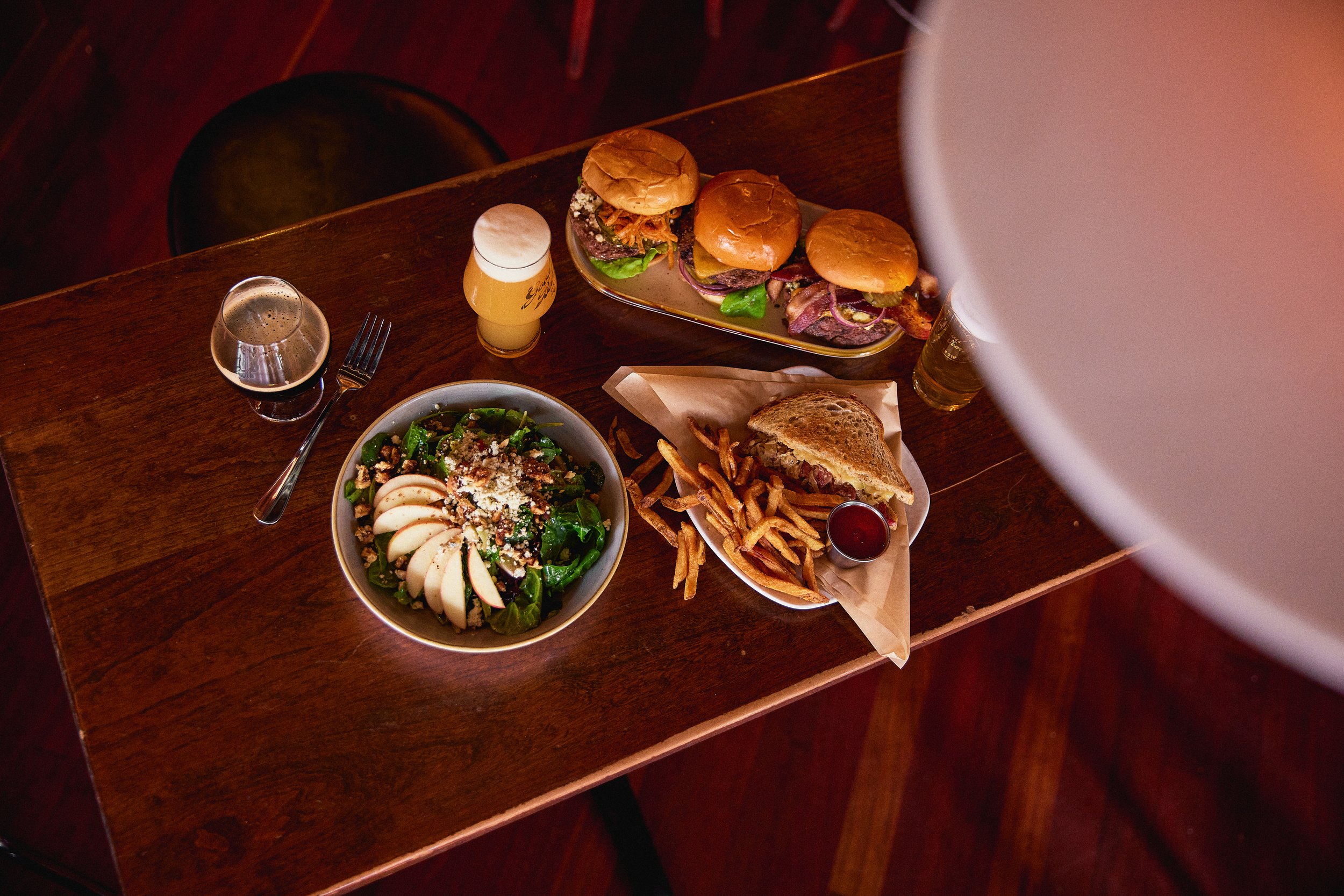
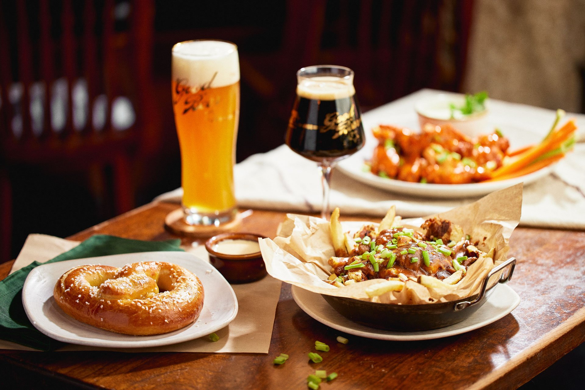
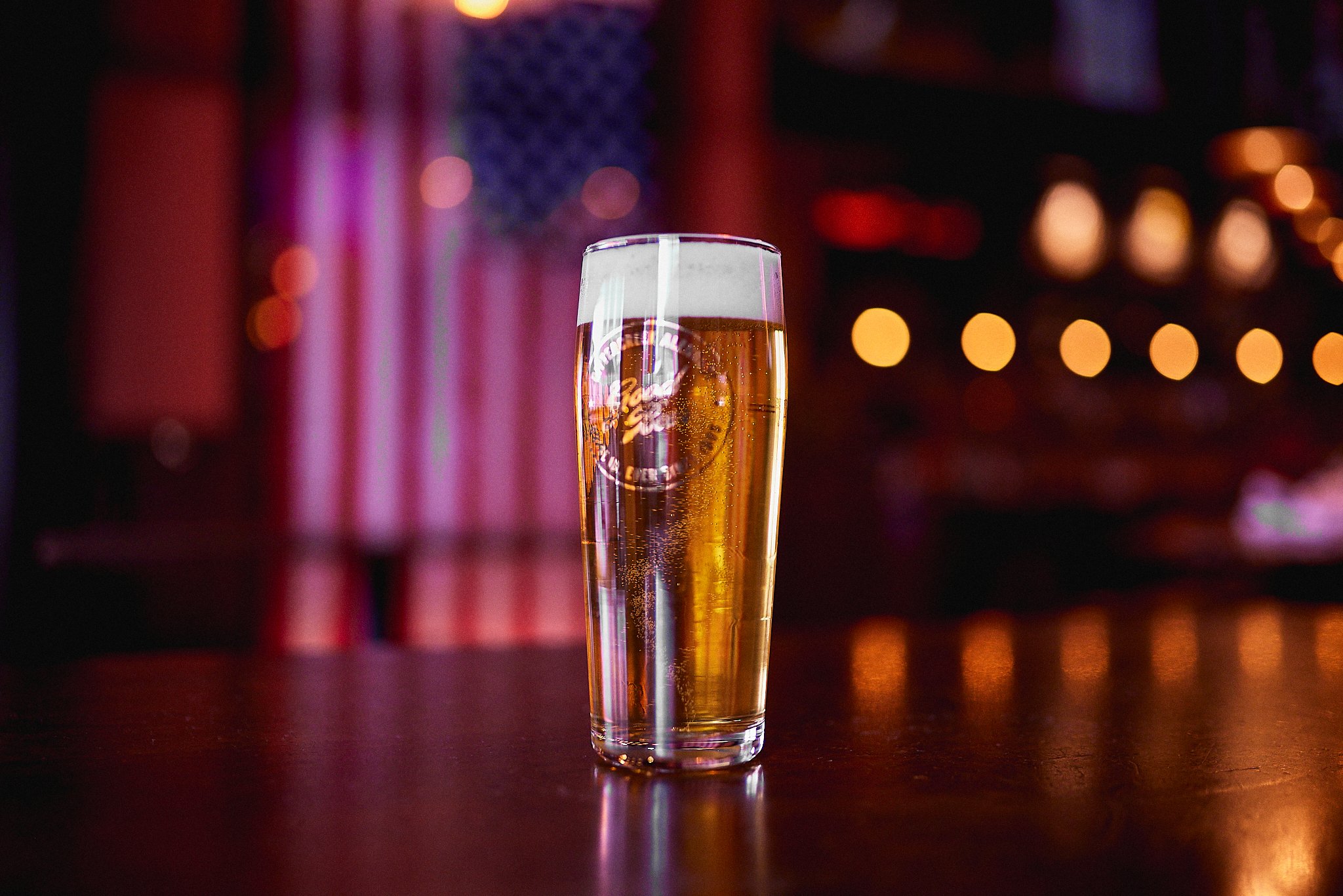
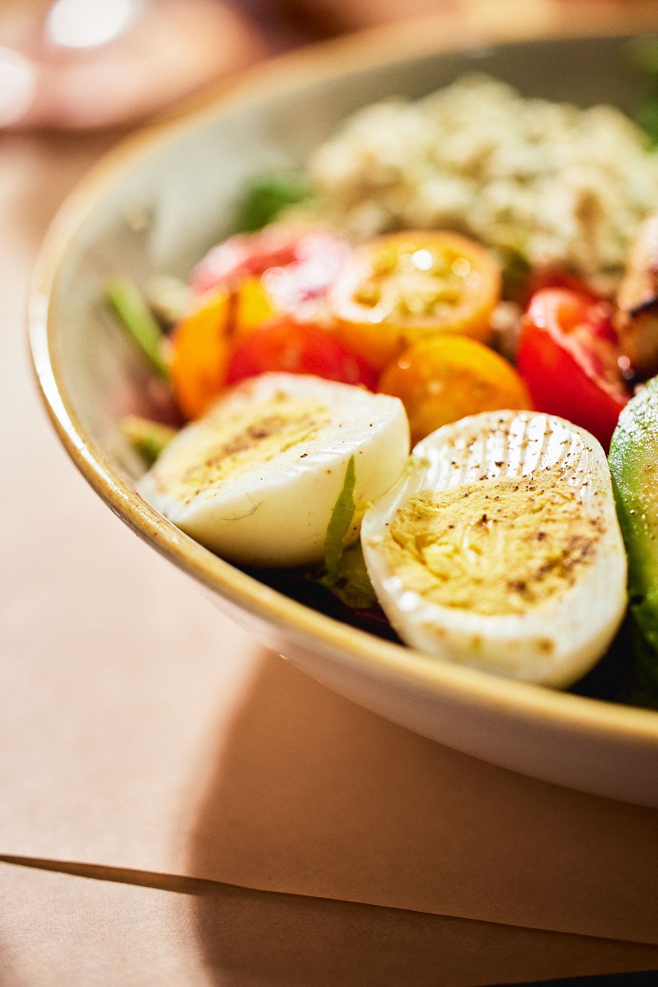
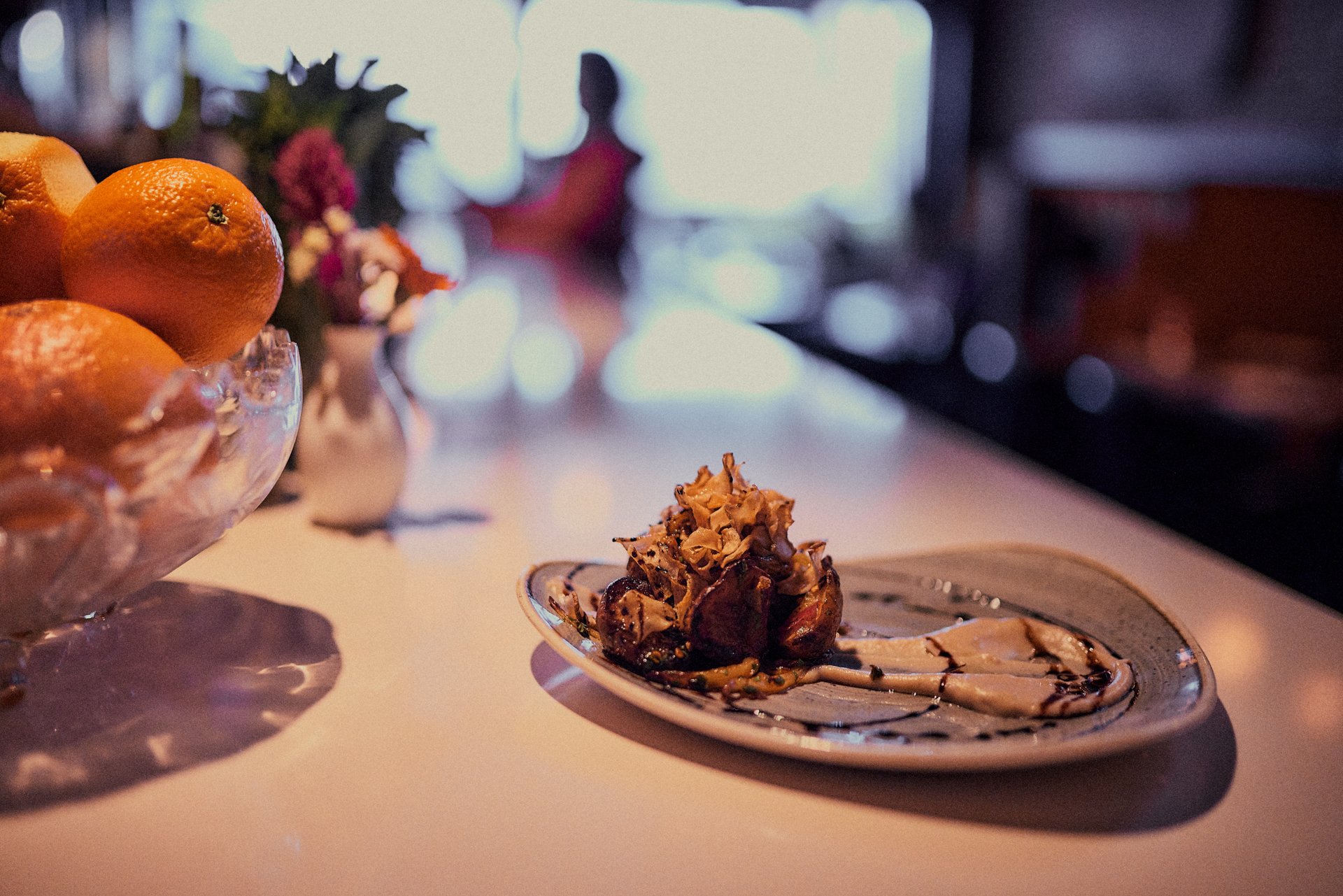
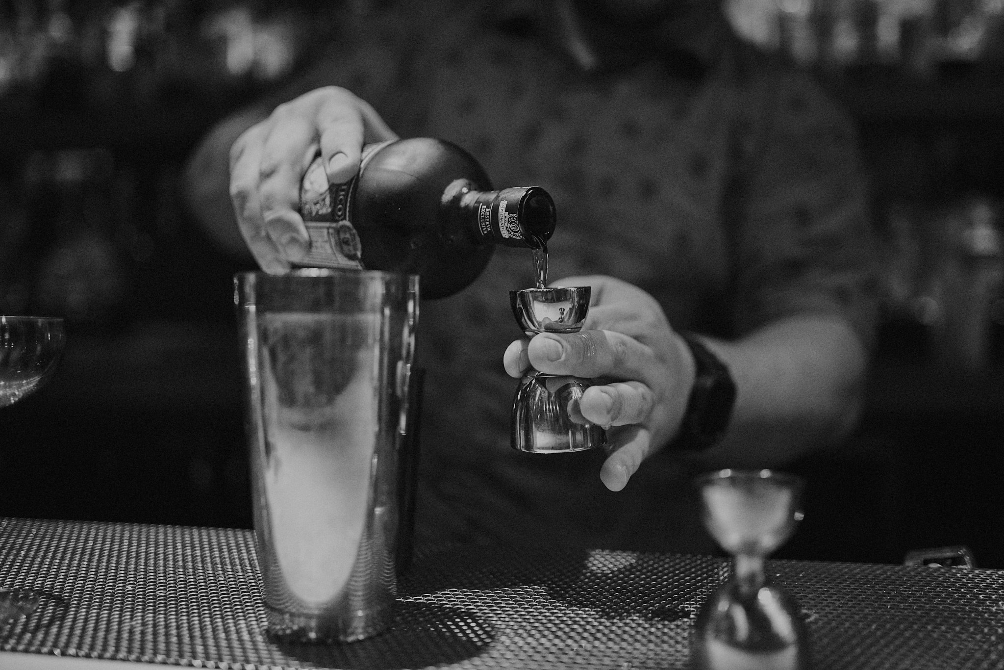
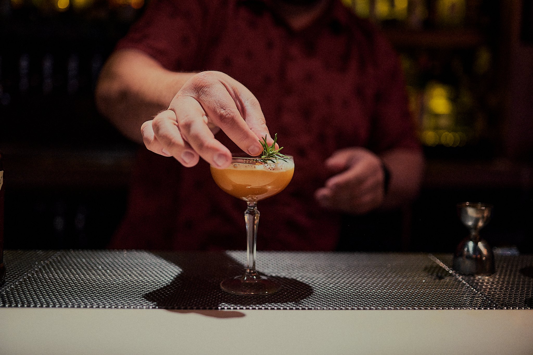
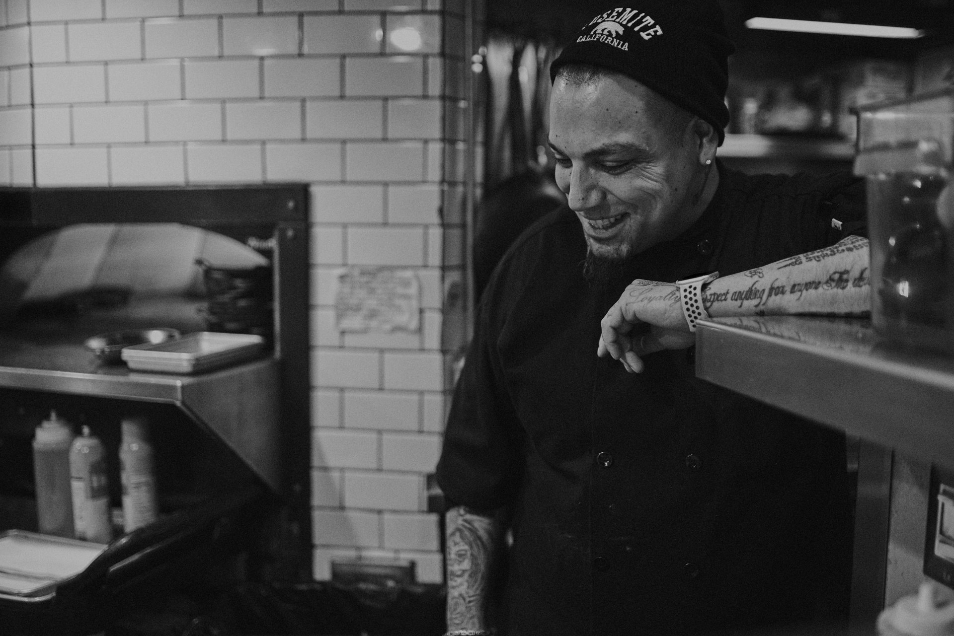
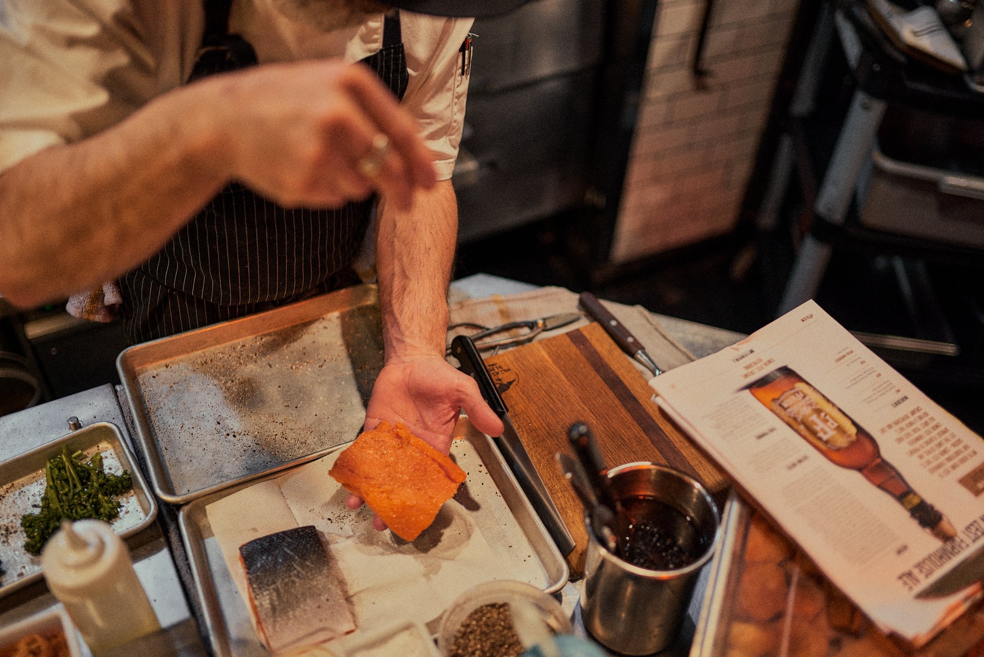
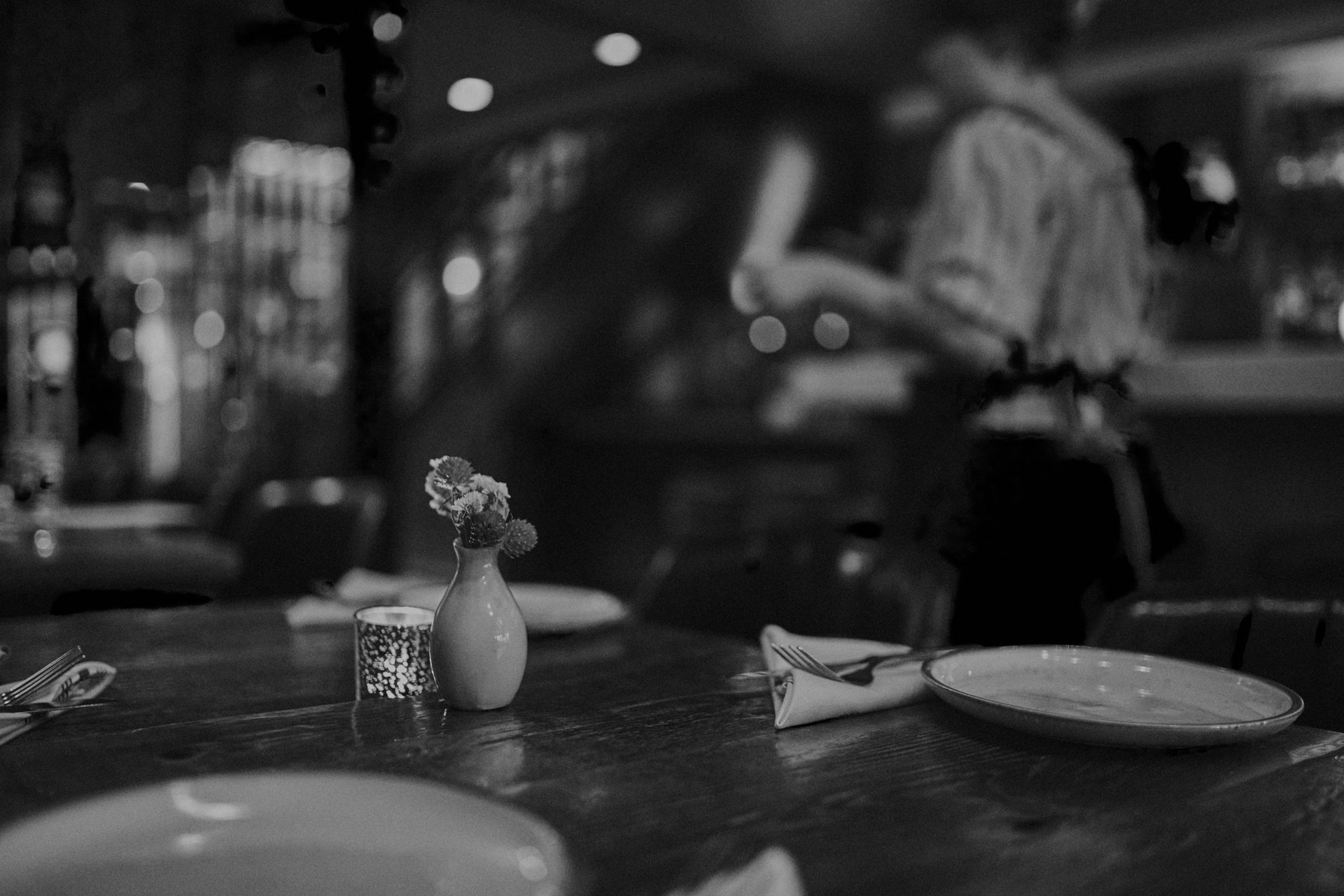
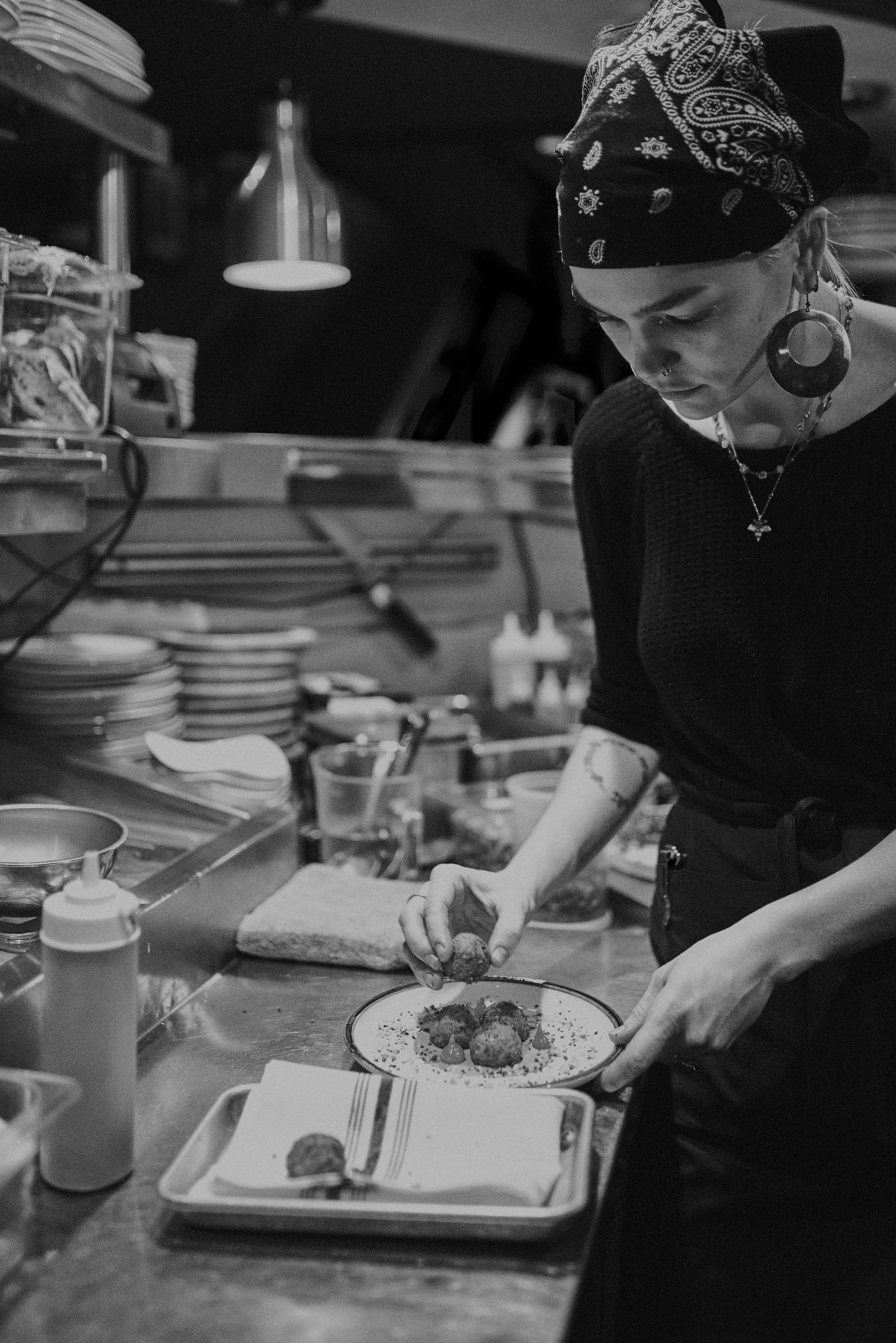
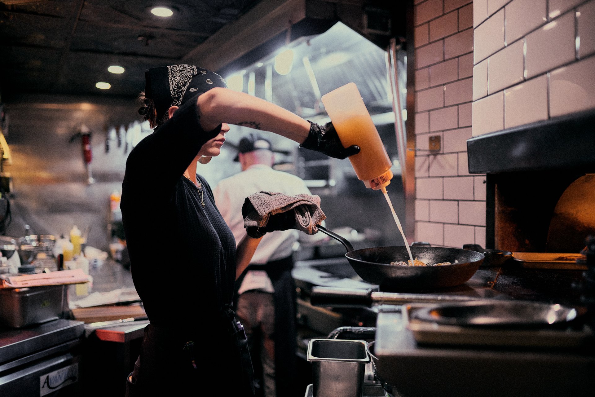
As we built the websites, we found a need to create a visual language through photography for each brand. We hired Visionkit Studios to help us build a photo treatment and style for each brand. Once we locked in the environment, styling, props and lighting it gave us the opportunity to shoot and edit in a more efficient and consistent way.
This led to our market strategy where we felt we needed to identify what paid, free, analog, and digital opportunities were available for each brand. Once we established our markets, we addressed what platforms, frequency, and budget we had to work with to ensure we were reaching the right people. We then looked at statistics and numbers available to us about who is using those channels, and best practices.
From there we moved onto our social strategy where we researched where our engagement was with the previous usage of instagram. We implemented the photos from Visionkit into our feed to help patrons better understand what the “vibe” of each restaurant is, while focusing our time and energy on making engaging reels that boosted our engagement and better told the story of how our food is made. Just Eat Local was the last to be addressed because we wanted to work out how best to represent the articles. We decided that posting a story on JEL and the other brands, paired with a post in the feed, was going to be the most effective way of getting people to the website. That in turn pushed people to check out our other restaurants. The ecosystem we created had increased our engagement drastically.
Lastly, the apparel on the floor at Bittercreek Alehouse and Diablo and Son’s had been in circulation for years. We felt it was time to start creating pieces that would be comparable to items we saw in the market. With a few days of research, we found some commonalities in the market that seemed to sell through well to those who regularly attended Bittercreek and Diablo. We designed shirts and hats that were geared towards our customers, and in doing so we’ve seen a huge spike in apparel sales.
Overall, we helped These brands reduce cost, increase visibility, sales, and drove more traffic to their sites and restaurants.
Role:
Creative Direction
Marketing & Social strategy
Identity Systems
Graphic Design
Apparel Design
Messaging
Copywriting





Diablo & Sons Saloon
Environment:
• Saloon inspired
• Minimal yet loose. Ingredients / props surrounding the food
• Beer, Whiskey, and Mezcal
Styling:
• Mix of dark and light surfaces
• ingredients on the table
Props:
• Liquor bottles
• Textured surfaces
• Hand made ceramic plates
Lighting:
• Mix of dark and Soft light
Bittercreek Alehouse
Environment:
• Relaxed Pub
• Playful/Messy food
• Beer focused
Styling:
• Dark Wood Surfaces
• Butcher Paper or wood surface
• Messy presentation
• French fries spilling over
• Beer overflowing
Props:
• Beer Glasses
• Long wall of beer taps
• Butcher / parchment Paper
• Coasters
Lighting:
• Mildly bright and warm
Red Feather Lounge
Environment:
• Modern lounge
• Cocktail focused
Styling:
• Darker backgrounds
• Simple presentation
• Focus on single items
• B&W & Color balanced
Props:
• Cocktail glasses
• Ingredients of drinks or food
• Marble top/darker tones
Lighting:
• Dark and moody


