Restaurant
SaltBrush
-
Saltbrush was born out of a passion for food, wine and gathering friends together. Partners Neil Grant and Erik Johnson met at a local wine event in Boise in 2020 and immediately discovered their shared background in the restaurant industry. Neil owned and managed three restaurants in his native South Africa, while Erik, who grew up in Boise, spread his wings as an executive chef in the California wine country. What started as a friendship grew into developing a shared vision of creating a space that has a warm, accessible ambiance with world-class cuisine and wine. Saltbrush was created to provide Boise with elevated dining uniquely combined with a warm, inviting feel.
After wrapping up the Vinspire project, Chef Erik, Neil and I began working on naming and messaging for Saltbrush. Over drinks, dinners, and good conversations we spent the next year and a half building the visual identity. As we worked through the concepts, the architect Tristan Du Plessis was working on the interior design, when eventually we met in the middle and found the perfect blend of mid-century modern meets' art deco.
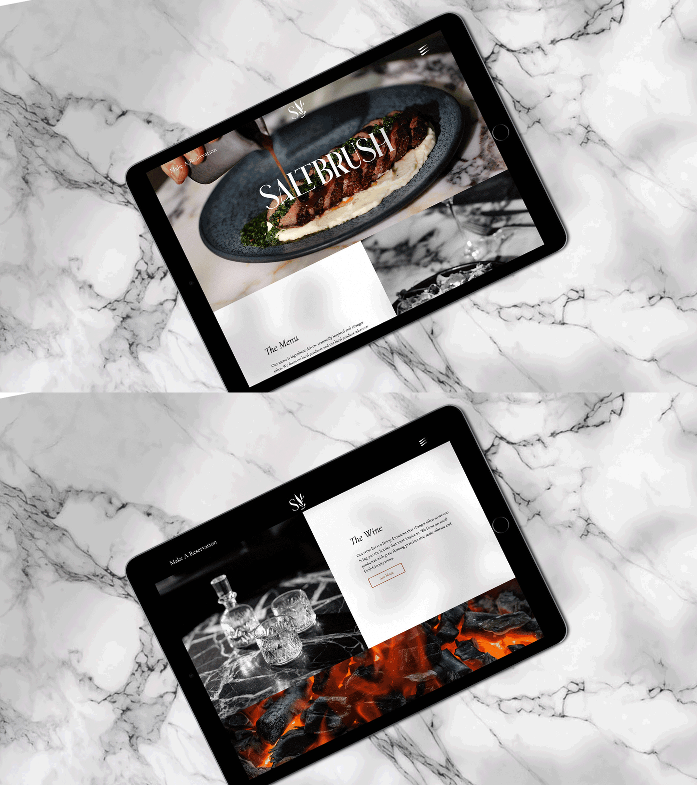
Every touchpoint of the business, from print to digital, was designed to emulate a sophisticated yet casual environment that brings a unique experience to the treasure valley. Signage was designed and installed by Trademark. I worked with Neil to create a simple but visually appealing website that we sent to Lately, who built the back end and put together a marketing plan for Saltbrush to execute on. Photo direction was provided in the early concepts and executed on by Peter Lovera.Role:
Creative Direction
Identity Systems
Graphic Design
Messaging


We are a lighthearted restaurant with a serious love of great grape juice.


Roasty, toasty and ready for anything


